Wednesday, June 22, 2011
Final exam!!!!
For my final exam I took one of the photos I had taken a while back that I really liked and chose a quote from a very wise man... Standing Bear. That was how I turned art into design.

Wednesday, June 8, 2011
1 Pound of Flesh
This image was inspired by a line out of a movie that came from a Shakespeare play called The Merchant of Venice. The line is "One pound of flesh, nothing more nothing less. No cartlidge, no bone, but only flesh." To me this line has a rather dark undertone so i decided to make an image with that same feeling.
In the movie, the line was on a note written by a murderer who made is victim cut of a pound of his own flesh. The had to choose between that or death. That explains the bloody scalpel. The design is not all that difficult to make; it took only two days.
In the movie, the line was on a note written by a murderer who made is victim cut of a pound of his own flesh. The had to choose between that or death. That explains the bloody scalpel. The design is not all that difficult to make; it took only two days.
- To start make a simple Gradient using gray and white. Make sure it coincides with the the angle of the shadow that you will have to apply to the scalpel.
- Next find an image of a scalpel or surgical knife and cut it out so that there is nothing left from the picture besides the actual knife/ blade.
- Go to Layer> Layer Style> Drop Shadow and apply a shadow to make it seem like the knife was just droped.
- Next add an effect. I used Filter> Artistic> Cutout. Alter it to your liking.
- Next use find, download and use a "Paint Splatter Brush" and go nuts, but don't go overboard because then your image will look sloppy.
- All that's left is it just add your text.
Tuesday, June 7, 2011
something different
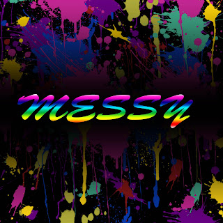
While I was looking through some photoshop tutorials i came across one that incorporated a"paintbrush slpatter" brush that I liked and thought I could make a cool image. I downloaded the set of brushes and went to work. I played with it using different themes and images I found online but none of the compositions came out as well as I had excpected.
 I kept searching through the endless piles tutorials and I just used all of my new found knowlegde to create one decent background/ image.
 I kept searching through the endless piles tutorials and I just used all of my new found knowlegde to create one decent background/ image.
- First I Filled the background with a solid black color.
- I created a new layer and used Layer> Layer Style> Gradient Overlay and made a gradient that followed a desired color x black x desired color scheme.
- Next I clicked on one of the many different Splatter brushes and evenly filled space with that color. (overdoing it would just make the image looking sloppy... not messy)
- Repeat that step as many times as you'd like with different colors
- Next Find a font you like and write your text.
- Use the Quick Selection Tool and select the text then alter the color by using Layer> Layer Style> Gradient Overlay and fill the text with your desired gradient.
Subscribe to:
Comments (Atom)
